
Reports
Unentropy generates interactive HTML reports showing how your metrics evolve over time. Reports include charts, statistics, and tools for exploring your data.
Generating Reports
Section titled “Generating Reports”Reports are automatically generated after metric collection in your CI workflow.
In GitHub Actions
Section titled “In GitHub Actions”The track-metrics action generates a report and uploads it as a workflow artifact:
After the workflow completes:
- Go to the Actions tab in your repository
- Click on the latest workflow run
- Download
unentropy-report.htmlfrom artifacts - Open the HTML file in your browser
Local Preview
Section titled “Local Preview”Preview your report structure locally without collecting real data:
This generates an empty report showing all configured metrics with placeholder data, then opens it in your browser.
Report Structure
Section titled “Report Structure”Each report contains:
Header Section
Section titled “Header Section”- Repository name
- Generation timestamp
- Data range (first to last build)
- Total build count
Metric Cards
Section titled “Metric Cards”By default, each metric gets its own card with:
- Chart: Interactive visualization of trends
- Statistics: Latest, Min, Max, and Trend
- Description: Metric purpose (if configured)
You can optionally organize cards into named sections and combine related metrics on a single chart. See Customizing Report Layout below.
Controls
Section titled “Controls”- Date range filters: View last 7, 30, 90 days, or all data
- Zoom/pan: Examine specific time periods in detail
- Export: Download charts as PNG images
Chart Types
Section titled “Chart Types”Numeric Metrics
Section titled “Numeric Metrics”Displayed as line charts with:
- Smooth curves showing trends over time
- Filled area under the line
- Interactive tooltips with exact values
- X-axis: Build dates
- Y-axis: Metric values (auto-scaled)
Example metrics: Coverage, LOC, bundle size
Label Metrics
Section titled “Label Metrics”Displayed as bar charts with:
- Bars showing occurrence counts per label
- X-axis: Label values
- Y-axis: Count of occurrences
Example metrics: Build status (success/failure), environment
Interactive Features
Section titled “Interactive Features”Synchronized Tooltips
Section titled “Synchronized Tooltips”Hover over any chart to see tooltips on all charts for the same build:
This helps you correlate changes across metrics (e.g., “when coverage dropped, did bundle size increase?”).
Zoom and Pan
Section titled “Zoom and Pan”Examine specific time periods in detail:
- Zoom: Scroll mouse wheel over a chart
- Pan: Click and drag horizontally when zoomed
- Reset: Click “Reset zoom” to restore original view
Zoom synchronizes across all charts automatically.
Date Range Filters
Section titled “Date Range Filters”Quickly focus on recent data:
- 7 days: Last week
- 30 days: Last month
- 90 days: Last quarter
- All: Complete history
The active filter is highlighted. Charts update immediately when you select a new range.
Export Charts
Section titled “Export Charts”Download individual charts as PNG images:
- Click Download PNG on any metric card
- Image downloads with chart title
- Use in presentations, docs, or reports
Exported images reflect current zoom level and date range filter.
Preview Mode
Section titled “Preview Mode”When you have less than 10 builds, the report includes a preview toggle to show what charts will look like with more data.
Toggle Preview Data
Section titled “Toggle Preview Data”The toggle appears below the report header:
- ON: Shows 20 synthetic data points demonstrating realistic trends
- OFF: Shows your actual collected data
This helps you:
- Validate report setup before collecting real data
- Understand chart appearance with sufficient history
- Test visualization features
Note: The toggle disappears once you have 10+ builds.
Preview Data Watermark
Section titled “Preview Data Watermark”Charts exported while preview mode is active include a “(Preview Data)” watermark to indicate synthetic data.
Sparse Data Handling
Section titled “Sparse Data Handling”Reports handle incomplete data gracefully:
Missing Data Points
Section titled “Missing Data Points”If a metric has no value for a specific build:
- Chart shows a gap (no line/point)
- Synchronized tooltip shows “No data for this build”
- X-axis maintains consistent timeline across all charts
Few Data Points
Section titled “Few Data Points”Metrics with fewer than 5 data points show a “sparse data” warning indicator. Collect more data to see meaningful trends.
Empty Charts
Section titled “Empty Charts”When no data exists in the selected date range:
Report Theming
Section titled “Report Theming”Control the visual appearance of your reports with built-in color palettes and light/dark mode settings.
Built-in Themes
Section titled “Built-in Themes”Unentropy ships with four built-in themes, each with dark and light variants:
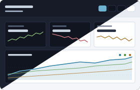
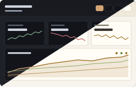
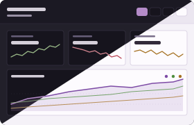
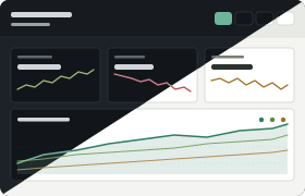
Set a theme in your configuration:
Custom Palettes
Section titled “Custom Palettes”Override individual colors to match your brand:
Each palette defines 12 CSS variables (backgrounds, surfaces, borders, text, accent, trend colors). You can override any subset; omitted variables fall back to Lattice defaults. Values must be 7-character hex colors.
Light and Dark Mode
Section titled “Light and Dark Mode”Control how the report selects between palette variants:
| Mode | Behavior |
|---|---|
auto | Respects system prefers-color-scheme (default) |
dark | Always uses the dark variant |
light | Always uses the light variant |
Locking to a specific mode is useful when sharing screenshots or hosting reports where you want a consistent appearance regardless of the viewer’s system settings.
Responsive Design
Section titled “Responsive Design”Reports adapt to different screen sizes:
- Mobile (320px+): Single column, stacked cards
- Tablet (640px+): Two columns
- Desktop (1024px+): Three columns
Print Support
Section titled “Print Support”Reports are print-friendly:
- Open report in browser
- Print or save as PDF
- Charts and statistics render correctly
Customizing Report Layout
Section titled “Customizing Report Layout”As your project grows, a flat grid of all metrics can become hard to navigate. You can organize reports into named sections and plot related metrics together on a single chart.
Sections
Section titled “Sections”Group related metrics under section headers:
Each section displays its name as a header with an optional description. Charts appear in the order defined. Metrics not referenced in any section are omitted from the report (they may still be used for quality gates).
Multi-Metric Charts
Section titled “Multi-Metric Charts”Plot multiple related metrics on a single chart to compare them directly:
This renders one chart card containing both metrics as separate lines with distinct colors and a legend. Metrics with incompatible units or vastly different scales automatically receive dual Y-axes so both series remain clearly visible.
Custom Chart Titles
Section titled “Custom Chart Titles”Override the default title derived from metric names:
Backward Compatibility
Section titled “Backward Compatibility”Omitting the report block entirely preserves the original flat layout: every metric gets its own single-metric chart displayed in definition order.
Publishing to GitHub Pages
Section titled “Publishing to GitHub Pages”Host your reports on GitHub Pages for easy team access.
Add Deployment Job
Section titled “Add Deployment Job”Update .github/workflows/metrics.yml:
Enable GitHub Pages
Section titled “Enable GitHub Pages”- Go to repository Settings → Pages
- Source: GitHub Actions
- Save
After the next workflow run, your report will be available at:
Example Reports
Section titled “Example Reports”Minimal Data
Section titled “Minimal Data”Report with 3 builds showing early trends:
- Preview toggle available
- All charts display sparse data warning
- Metrics show “N/A” for trend (insufficient data)
Full History
Section titled “Full History”Report with 100+ builds showing rich trends:
- No preview toggle (enough data)
- Clear trends visible (↑ increasing, ↓ decreasing, → stable)
- Zoom/pan useful for examining specific periods
Multiple Metrics
Section titled “Multiple Metrics”Report tracking 5+ metrics:
- Grid layout shows all metrics at once
- Synchronized tooltips help correlate changes
- Date filters let you focus on recent activity
Accessibility
Section titled “Accessibility”Reports meet WCAG 2.1 AA standards:
- Color contrast for readability
- Keyboard navigation support
- Screen reader labels for charts
- Focus indicators on interactive elements
Troubleshooting
Section titled “Troubleshooting”Report Shows No Data
Section titled “Report Shows No Data”Problem: Empty charts despite successful metric collection
Solutions:
- Verify metrics were collected successfully in workflow logs
- Check storage backend is working (database accessible)
- Ensure
track-metricsaction completed without errors - Download database artifact and verify it contains data
Charts Not Interactive
Section titled “Charts Not Interactive”Problem: Tooltips, zoom, or filters don’t work
Solutions:
- Ensure JavaScript is enabled in browser
- Check browser console for errors
- Verify CDN resources loaded (Chart.js, chartjs-plugin-zoom)
- Try a different browser (Chrome, Firefox, Safari, Edge)
Preview Toggle Doesn’t Appear
Section titled “Preview Toggle Doesn’t Appear”Problem: Expected preview toggle but not visible
Possible reasons:
- You have 10+ builds (toggle only shows for <10 builds)
- Report was generated with older version
- JavaScript error prevented toggle from rendering
Solution: Check build count in report header. If <10, check browser console for errors.
Exported Charts Are Blank
Section titled “Exported Charts Are Blank”Problem: Downloaded PNG files are empty or corrupted
Solutions:
- Wait for chart to fully render before exporting
- Disable browser extensions that might interfere
- Try exporting from a different chart
- Check browser console for export errors
Dark Mode Not Working
Section titled “Dark Mode Not Working”Problem: Report doesn’t use dark mode
Solutions:
- Check
report.modein your configuration. If set to"light", the report will always use the light palette regardless of system settings. Change to"auto"or"dark"to enable dark mode. - If
report.modeis"auto"or not set, dark mode follows your OS preference. Check your system dark mode setting. - Some browsers need to be restarted after changing system preferences.
Related Resources
Section titled “Related Resources”- Metrics Guide - Configure metrics to track
- Getting Started - Initial setup
- Storage Guide - Where reports are stored